When you study how artists like interior designers, painters, architects, and clothing designers utilize color, you’ll gain a sense of how various shades can be leveraged to inspire and elicit certain emotions.
Color is such a pivotal piece of designing jewelry that’s both aesthetically pleasing and captures the attention of prospective buyers.
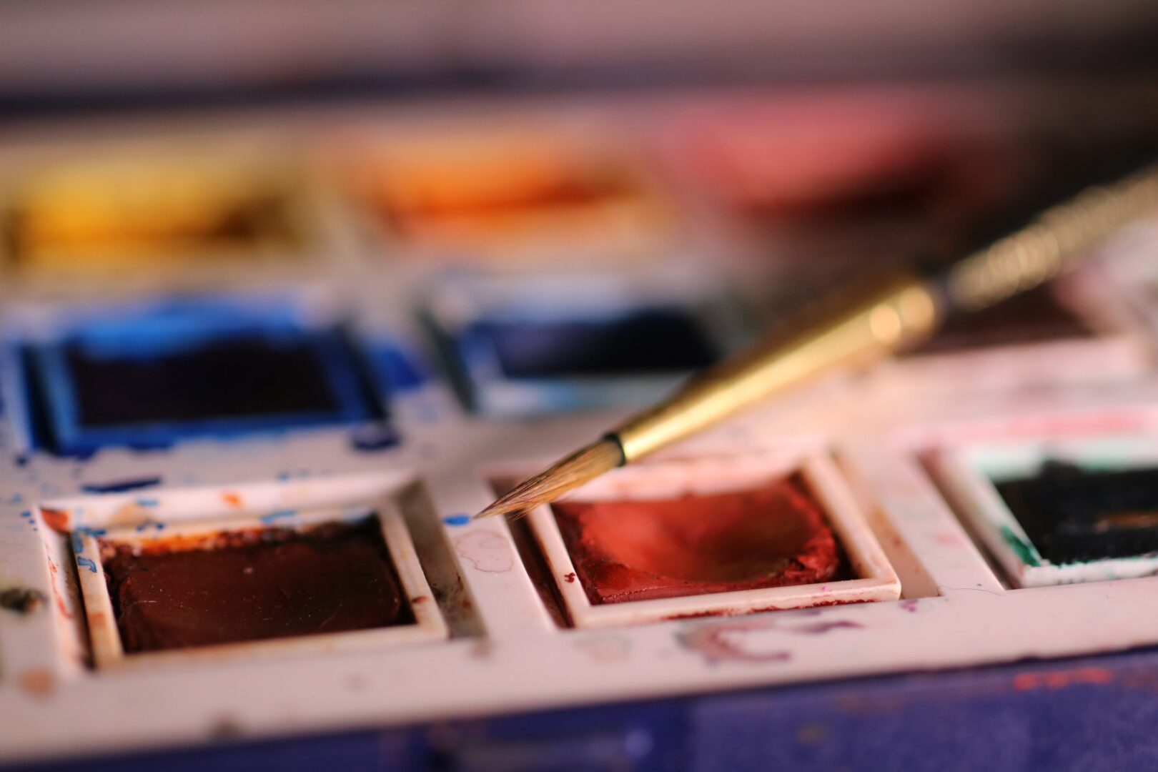
In color theory classes (like our Origins of Color workshop!), paint is typically the medium used to produce various hues. When it comes to jewelry, using paint on beads and similar components requires strategy and technique in order to generate the desired effect.
The key to crafting successful jewelry designs? Understanding the color spectrum and how to combine different hues to make your pieces pop.
How Color Impacts Jewelry Design
Color has the ability to shift someone’s mood, and is part of what makes us gravitate to specific pieces. Though everyone perceives color differently, you can pull from a deep understanding of how different color combinations can resonate. As a designer, you can learn how to make different shades and hues work together with other elements of design — in light of your desired effect.
In other words: Your artistic intention + an understanding of color, and how it impacts = powerful jewelry design.

Making a statement with color.
Envision what you want your jewelry piece to say, and choose colors accordingly. If you want to make a loud and bold statement, consider red. Red is most commonly associated with passion, intensity, love and rage. These are powerful emotions to ignite! Kathy Lamancusa describes red as bold and garnering attention. Knowing the right amount of color to use to draw people in is all a part of the process of understanding the color wheel and how to use it in your art making.
Blue, on the other hand, eases and calms. We will naturally (even if subconsciously) associate blue with the ocean, the sky — water elements and fresh air. We experience color in context. Awareness of how we all contextualize different colors will empower you as a designer, so you can use these associations to resonate in an intentional way.
First, think about what you want your piece to say, and bring in color combinations to reflect that.

Using color to establish your unique style — your brand.
You always know a Pandora bracelet when you see one. Their use of a silver band paired with light colors such as pinks and rose gold make their designs recognizable to the consumer. They’ve established their brand.
Color is one way to tie together a collection of diverse pieces — to make all your jewelry feel cohesive, so that a person could recognize a creation as yours just by the feel of it.
How can color help you develop your unique artistic brand? What kind of beads or metals are you using? What materials go into your designs? The ingredients of jewelry can be combined in infinite ways, and color is one of those elements that can help you create a cohesive style.

How to choose?
As jewelry designers, we select colors in order to “clarify and intensify”. Warren Feld says it well:
“As a design element, color is used to attract attention. It aids in grouping some objects and setting boundaries between others. It can emphasize and focus. It conveys meaning and value. Usually color enhances the aesthetics and appeal. Color can be used as an organizing tool and create segments, components, rhythms, movement, dimension and hierarchical arrangements within your jewelry composition. Color can affect the figure/ground relationship of the composition.”
When you understand where colors come from, and the kind of impact they have on our emotions, you can harness them to resonate in specific and precise ways.
At New York Jewelry Design Institute, we love and obsess over how to pair cohesive color structures with each other to achieve desired effects. In our Origins of Color workshop, you’ll learn about the color spectrum, color blocking, and the amazing histories behind different colors from our trained instructors.
The world would be a bland place if color didn’t exist. Imagine if the sky wasn’t a beautiful shade of baby blue? Or if apples weren’t vibrantly red? Color is a vital aspect of design. It helps determine what your piece of jewelry will say about you, your artistry and your brand. Most importantly, it will determine how others feel when wearing your designs.
In many incidents, the color matters more in jewelry design than anything else.
Being able to best utilize color in jewelry design will help you become better at your craft. Color is just as important to jewelry as it is to famous paintings, evening attire, and expensive makeup palettes.
Pssst. The Origins of Color class is just one of many in depth classes we offer that will help students with jewelry design. Since 2014, Founder and Creative Director Jenine Lepera Izzi has worked hard to help her students flourish in the world of jewelry design.
Listen to Jenine talk about her work at the New York Jewelry Design Institute and take your first step into this creative and stunning world in this video!
[INSERT VIDEO]

